Case study
BBC Sounds Category Experience
Project summary
The primary objectives of BBC Sounds are to increase the time users spend listening, to improve user satisfaction, and to increase the number of signed-in users. To attain these objectives, a redesign of the category experience on BBC Sounds was needed.
A multifaceted project spread over many phases, teams, and timescales was undertaken to facilitate the redesign. The UX team’s primary goal, for the first few phases, was to redesign the front end and ensure users could easily find content relevant to them.
Role: User experience designer
Tasks: Competitor analysis, user flows, sketching, wireframes, prototyping, final design, research, dev pairing
Approach: Audience research and feedback review, competitor analysis, user flows, design exploration and refinement, prototyping, guerrilla research, lab research, dev pairing, release
The challenge
Hypothesis
If we offer more appealing content throughout our category journeys, then users will listen to a broader range of programmes. This will increase the time spent listening.
Categories are the only way for users to explore the BBC Sounds content catalogue in its entirety.
Ensuring users can find the content they want is a long-term, multi-team problem, but if the issues with the front end can be improved, BBC Sounds would be on its way toward reaching some core objectives.
Research
Previous qualitative research and user flows created by members of the UX team proved useful when attempting to clarify deliverables for the first phase of the categories redesign.
Qualitative research
Key feedback from qualitative research included an inability to access BBC Sounds categories, a desire for an obvious link to all categories (with some users asking for iPlayer Radio’s horizontal navigation to be reinstated), and general unhappiness about missing categories and how programmes are categorised.
Pain points
A multidisciplinary ‘Journeys’ workshop I had contributed to also highlighted some key pain points, including issues with the number of categories available on the landing page, the absence of descriptions and metadata, the lack of ‘Mood’ or ‘Format’ categories, and an omission of filtering options.
User flows
I also reviewed user flows created by the design lead, which highlighted a click-heavy journey from landing page to playback, with users having to click out of BBC Sounds (to BBC Programmes) and click back in again. As well as frustration, this led to substantial drop-off rates.
Deliverables
Phase one of the categories work would look to deliver a category index page, the first iteration of a category hero page (reserved for the most popular and populous categories), and a list page. This would immediately tackle some of the issues that users experienced in terms of finding all available categories, and it would also alleviate some of the tangled journeys users were having to take.
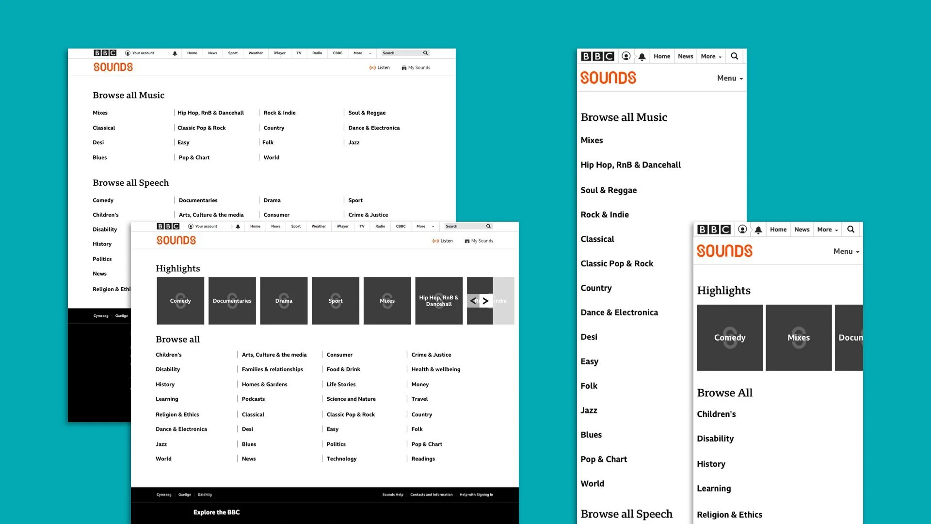
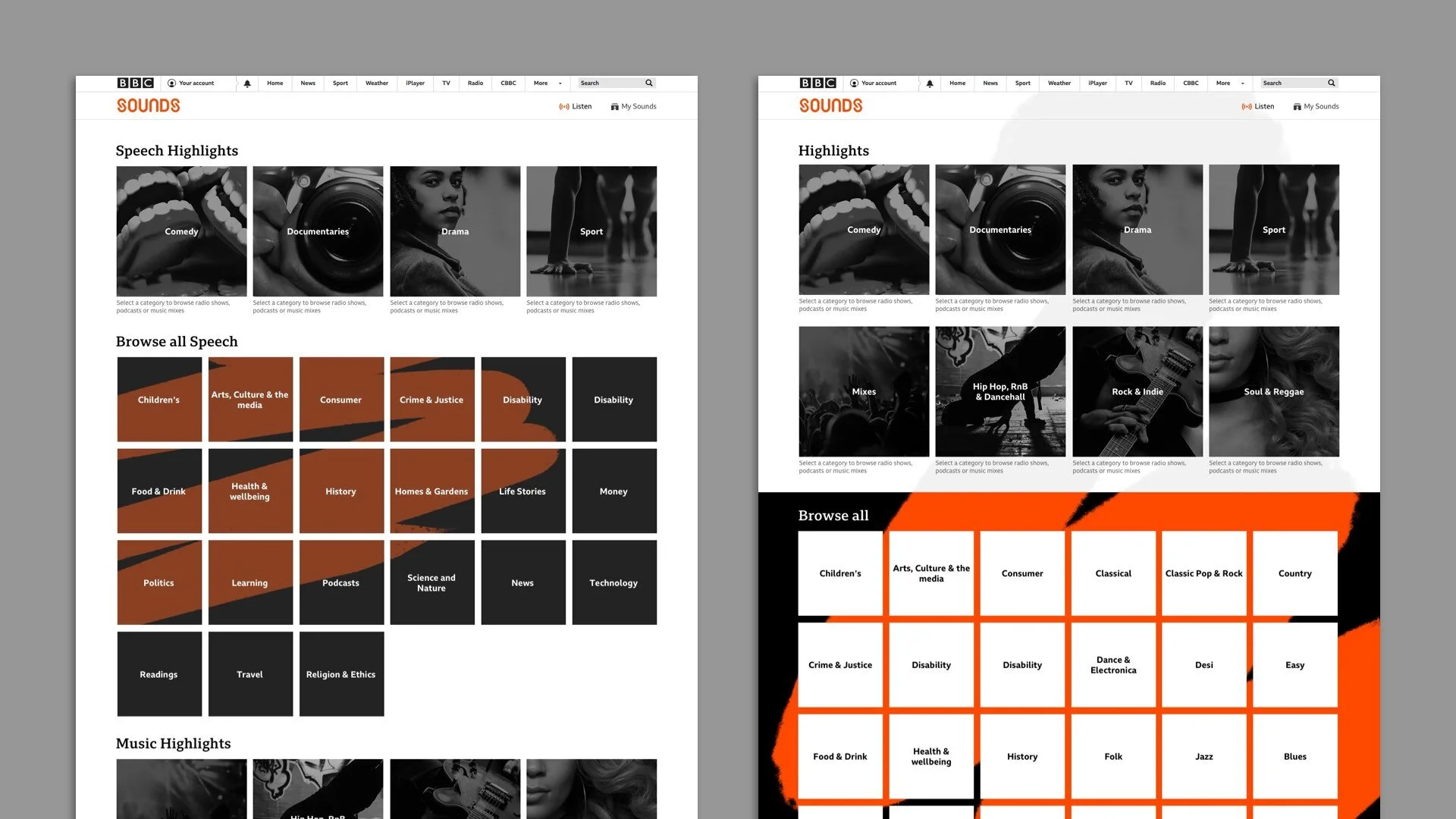
Category index explorations
For my initial explorations, it was essential I make use of the current design system and avoid creating any new components unless absolutely necessary.
Other key requirements included reducing the number of categories (to the top 40, as determined by qualitative and quantitative user data) and splitting categories into Music and Speech (network stakeholders had requested this and testing indicated that it would be appreciated by the audience).
The card solution proved popular with stakeholders due to the clearly visible nature of the categories, cross-platform adaptability, and possibilities for visual enhancement.
Category list exploration
I had already created generic list views for a previous project. Further explorations allowed me to adapt them for the category pages. The list views had several uses, but they were predominantly used to show hero page sub-categories and allow users to view all episodes from a brand.
Hero Page
Hero page explorations were being conducted by the design lead, but it was essential for us to meet regularly to ensure that the category experience solution remained coherent.
Additional components
Alongside the development of the main pages, agreement was required on solutions for small-scale components needed to help provide a valuable experience.
Pagination
Using the BBC Global Experience Language pattern as a framework, I overhauled the pagination component, ensuring I resolved some critical issues that became evident due to the amount of content available in BBC Sounds.
Sort pattern
The Sort pattern we had used with iPlayer Radio was received well by users. Therefore, my only task was to repurpose the Sort pattern, enabling us to reinstate it for BBC Sounds.
Filter pattern
I also experimented with a few filter pattern examples. Although this was a much-requested pattern, there are questions around the site architecture that need to be answered before release. However, we did create several prototypes, which enabled us to conduct guerrilla tests with four BBC Sounds/iPlayer Radio users.
User flows
Research sessions were arranged to allow us to test our hypothesis about the category pages. I created a few user flows to help double-check our assumptions internally.
Design research
A broad range of issues was researched, including user reactions to the number of categories, ease of use, expectations for category pages, and the overall category journey.
The overall reaction to the category index page was positive. Participants liked having the in-depth overview, with most users able to navigate to the episode page fairly quickly.
There were still some questions about the choice of categories and personalisation, with these issues scheduled to be iterated on in the future.
Launch and next steps
Phase one of the categories work was launched successfully. The BBC Sounds team continued to iterate on the pages based on feedback from testing, while I continued to explore ideas for moods and formats.


