Case study
BBC US Election Results Service
Project summary
The US Election took place in November 2020 and has always been a major news event for UK and global audiences. Previous research into US Election coverage has shown a huge appetite for the BBC’s live results service.
The 2020 results service aimed to continue providing a fast and accurate results service while being mindful of audience concerns around bias, confusion around US political jargon, and the US electoral process.
Role: User experience designer
Approach: audience research review, competitor analysis, audience definition, user flows, multidisciplinary design sprints, design exploration, prototyping, research, and refinement, dev pairing (internal and external), accessibility reviews
The challenge
Deliver live election results data to a hugely diverse audience alongside the BBC’s rich editorial content. The results service needs to set out data and information clearly, be easy to understand, and make it easy for users to find what they are looking for no matter what device is being used.
Research
A considerable amount of research was available about the Results banner that I helped create for the 2016 US Election, as well as some general audience data. Common themes that would influence the 2020 service became apparent as we reviewed the documents.
Audience
We did not create personas specifically for this project. But, an important part of the process involved studying our previous personas, as well as analysing our new election archetypes (created by an external agency).
Although based on UK General Election users, common election user needs were identified in both sets of studies. Combining this with BBC Audience data, we were able to build a clear picture of who we were creating the election service for.
Editorial insights
We worked closely with the editorial team and analysed their research to ensure the UX, product, and editorial objectives were aligned. There was also a lot of quantitative data to analyse from the BBC Audiences team. Reviewing both pieces of research revealed some key insights that tied into the UX brief.
Competitor analysis
High-level findings from the 2016 competitor analysis (based on the 2012 election) remained valid for the 2020 service. However, a key part of our brief was to gather some 2016 examples, both individually and as a group, to see whether any new trends had emerged from national and international providers.
Two key trends the Politics team needed to be aware of were:
US news providers promote the personality running for president, whereas UK providers focus on a simplified overview – was this something to aspire to?
US news providers had very informative services – would this also work for a UK audience who, for the most part, lack in-depth knowledge of the US Election process?
User flows and sitemaps
I created a basic sitemap and some user flows to help us agree on what deliverables would be required from the UX team. We would later employ the services of a UX architect to create some in-depth flows and site maps to help clarify any issues brought up by stakeholders.
Design sprint: Multidisciplinary investigation
We used a standard design sprint approach but, due to COVID restrictions, we completed the sprint remotely.
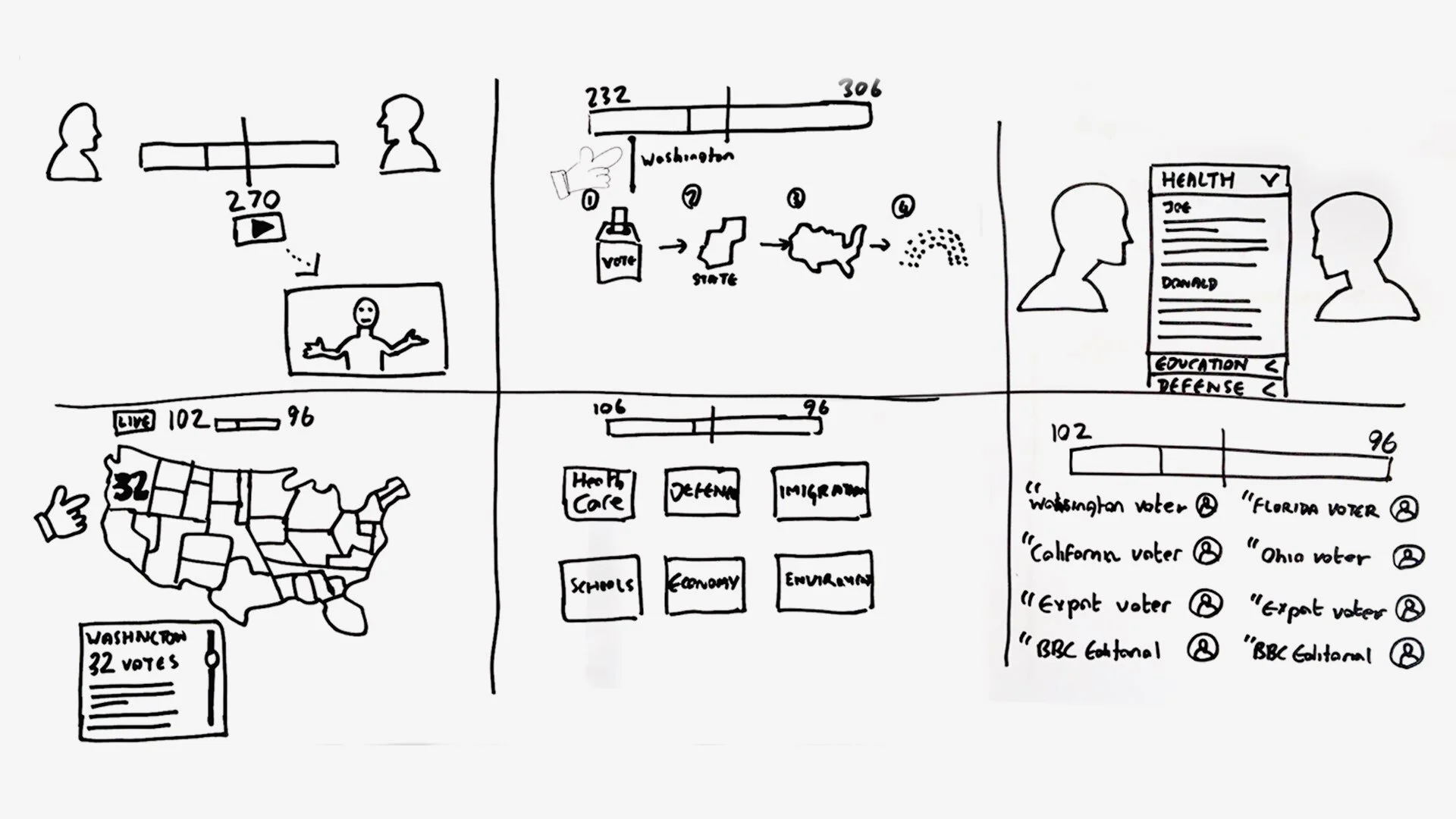
The sprint consisted of a short understanding session for participants not familiar with the previous research and analysis. We then defined three core user needs; update at a glance, state-by-state results, and congress results.
Sketching
Three remote sketching sessions took place covering the three user needs. After dot voting, we settled on a set of ideas that the UX team would investigate further to resolve outstanding questions.
Validation
Unfortunately, COVID restrictions meant we could not prototype and guerrilla test any of our ideas. Therefore, to help us evaluate our ideas, we relied on previous research, conducted very rapid testing with members of our teams, and mapped our ideas to specific user questions from our previous research.
Descoping
Regrettably, due to a variety of circumstances, the decision was taken to reduce the number of deliverables to be completed by the Politics team.
To ensure we could provide the level of service expected from the BBC, the decision was made to engage with a third party to provide some of the low-priority components, and for the internal team to focus on the Results banner.
Design refinement
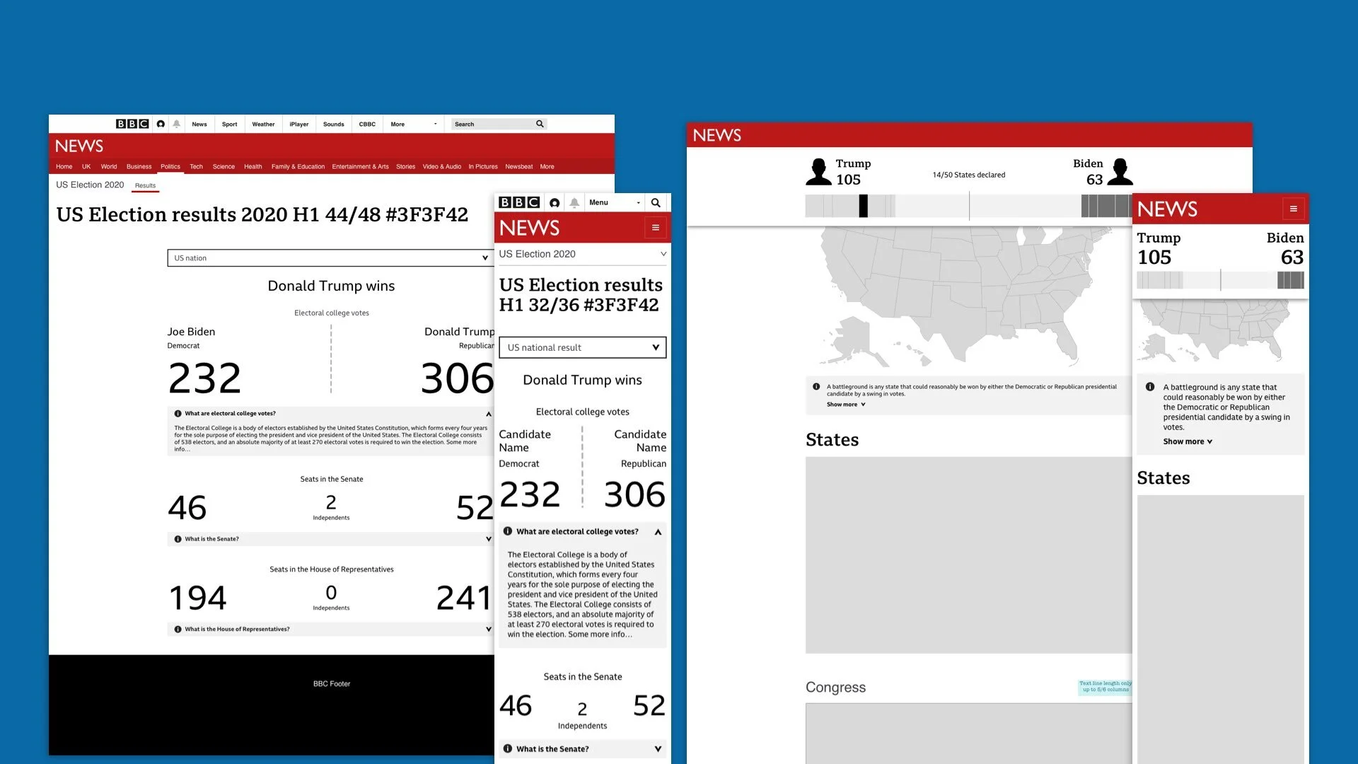
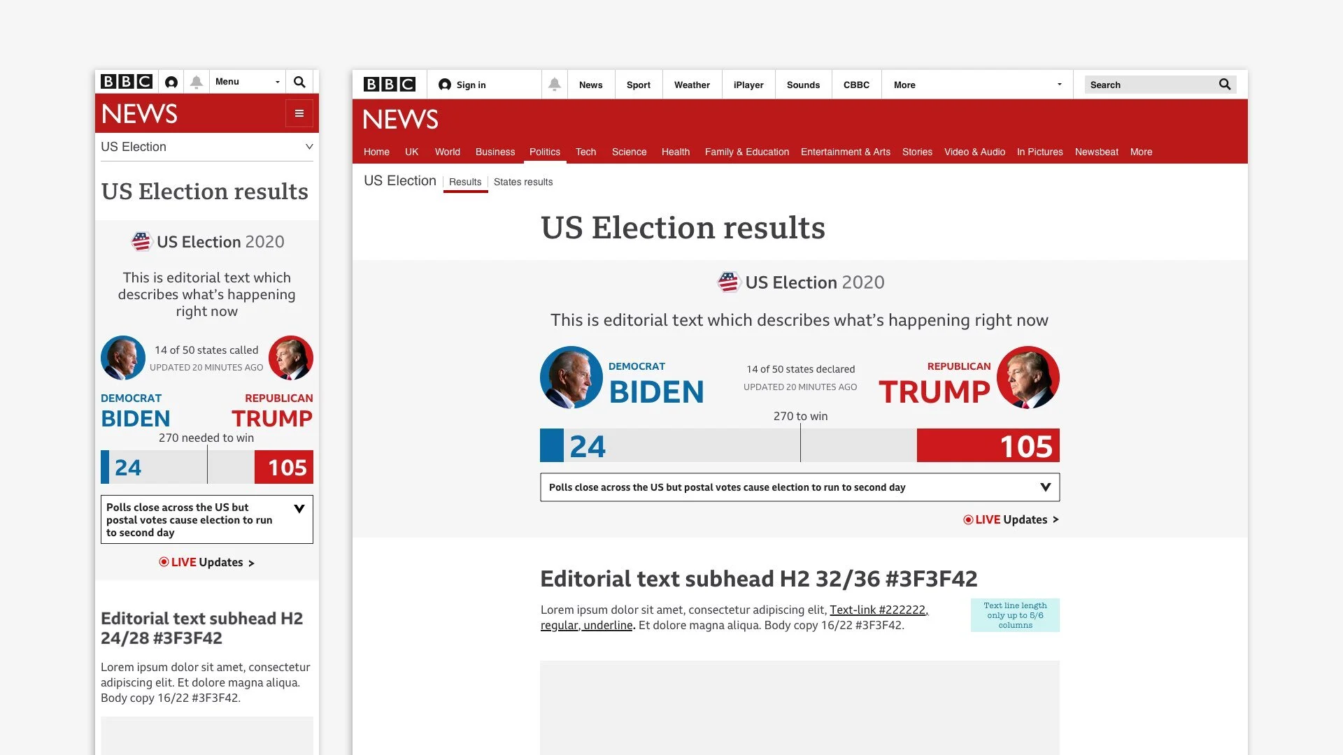
I continued to examine the sprint ideas for the Results banner, eventually narrowing them down to a few key options. In collaboration with the Politics team’s design lead, we settled on a solution that would be understood by all users; is a common design pattern followed by many other news providers for this type of election; and was similar to our 2016 banner but with opportunities to add headlines and answers to common questions (one of our primary user needs).
Final design
The UX team, in collaboration with our team’s engineers, set about solving some outstanding issues regarding the final design.
Explainer
The Explainer pattern was a replacement for the ticker used in 2016. This allowed us to deliver easily digestible, contextual information about what was happening in the election without leaving the results service.
Banner configurations
Certain pages carrying the Results banner needed specific configurations. The main changes revolved around the use of the election logo, the use of the Explainer component, and the position of specific links.
World Service
We were also delivering the US Election service in multiple languages. I had to carry out a series of explorations and tasks before these could be signed off. These were:
Investigate ad placement
Ensure flexible components are stress-tested for all languages
Ensure Cyrillic and Arabic fonts do not cause unforeseen bugs and errors
Brand alignment
One of the key business objectives for this election was a service that was coherent across all devices, platforms, and services. This required a weekly design alignment meeting with the visual journalism, TV motion graphics, and infographics teams to present my work, help agree on brand guidelines, and ensure all work had a consistent look and feel.
Accessibility
The BBC’s commitment to providing an inclusive service resulted in an in-depth review of the service before launch. The chosen method was accessibility swarms, in which each member of the team chose a few devices, visited the responsive site, and looked for anything that did not adhere to the BBC’s Accessibility Guidelines.
Third party components
The remaining components were supplied by a third party. As a team, we still had to manage the delivery of the components as there are specific design, engineering, and accessibility guidelines that all BBC products need to adhere to (e.g., colour contrast, fonts, JavaScript, assistive technologies, and so on).
Early outcomes
Early metrics showed 176 million page views for the live service (Results banner, live stream, live video), with smartphones being the main device of choice.
The unusual nature of this election meant that the Explainer component was put to good use spelling out the reasons for the delay in calling the result. This was well received.
Full qualitative research will be carried out on the service in 2021, and the findings will be used to improve future national and international elections.


